A word about your handwriting...
In this course, you will be creating and labeling a number of beautiful pieces for your portfolio. Two things come to mind. First, your handwriting!
 One of our students, Ann Jordan, displayed exceptionally beautiful descriptions of her work. When I commented on it, I learned that she took calligraphy. In this day of using the keyboard ever more, neglecting the use of our hand for writing, it might be worth exploring, if you intend to continue in this direction.
Ann found two books on italic calligraphy that are still in print and might be useful: "Italic Calligraphy and Handwriting" by Lloyd J. Reynolds (about $7.00) and "Calligraphy in Ten Easy Lessons" by Eleanor Winters and Laurie E. Lico," also still in print. ($12.95) Both are paperbacks. Another option is to take a beginning calligraphy course. Italic calligraphy would undoubtedly be taught in a beginning course.
To the left is an example of Ann's lovely hand...
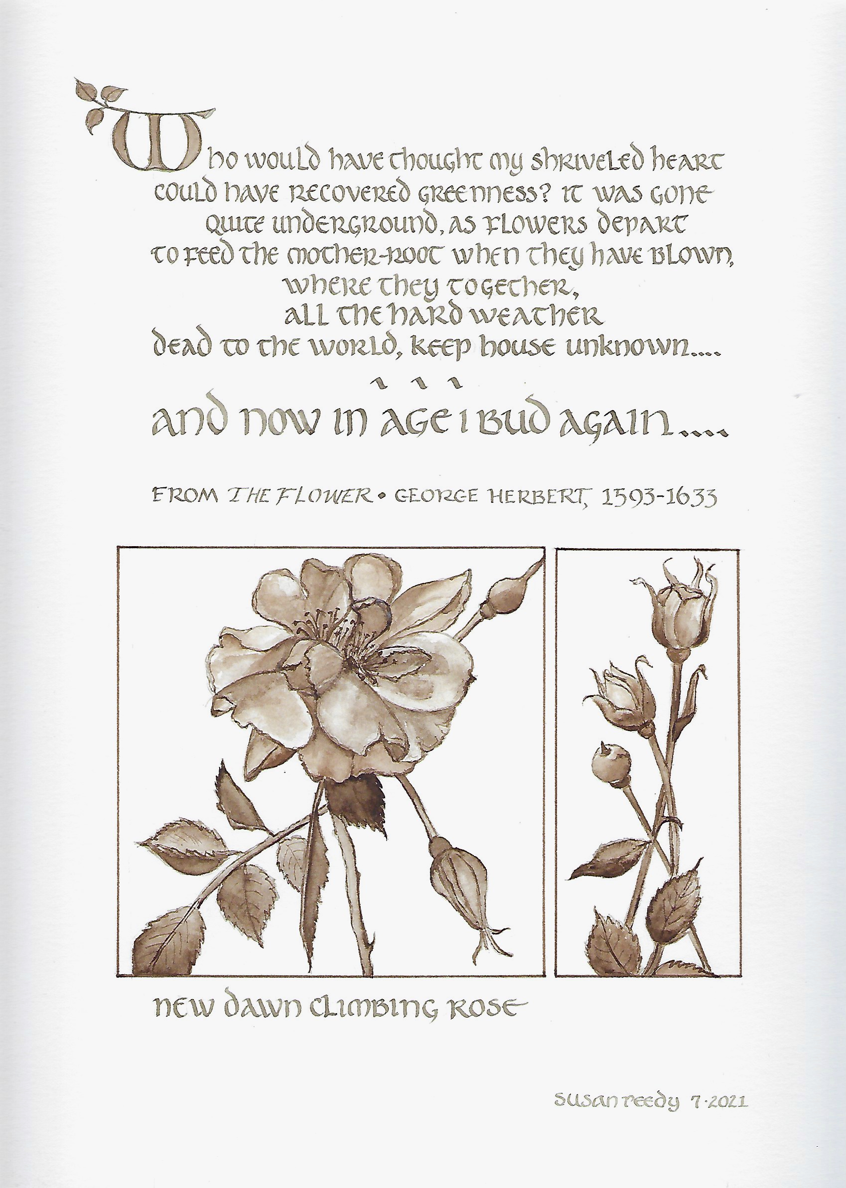
You may become so excited about lettering and calligraphy that it becomes a major part of your work. Another student, Susan Reedy, uses illustration and calligraphy complementarily.
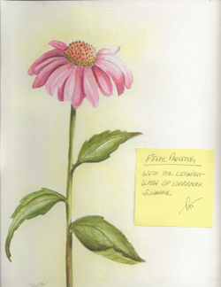 The second concern is how you communicate information about your work, making certain that it doesn't detract from it. I have had students submit stunning images, only to scrawl a note alongside the image that says something about the piece, with the exercise label, such as Exercise 4.3, etc. While it may not 'ruin' it, it definitely takes away from it. I thought Pat Boon came up with a novel way of communicating information with stickies in the watercolor course. There might be situations in which you do the same...
In summary, I will encourage you to consider how you label, what you include, and to keep it as neat as possible. For some with poor handwriting, this may be an additional challenge. However, I am confident that you will do a terrific job with it.